

Best Practices for Sports Team Banners: 2026 Guide
Table of Contents
- Why Sports Team Banners Still Win Attention
- Standard Sports Banner Sizes and Viewing Distance
- Durable Materials for Outdoor Sports Signage
- Sports Team Banner Design Templates That Work
- Layout, Typography and Color Contrast for Readability
- Print Files, DPI and Printing Methods Explained
- Mounting, Display and Maintenance for Long Banner Life
- Compliance, Sponsorship Placement and Eco-Friendly Options
- Frequently Asked Questions
Last Updated: September 30, 2026
Why Sports Team Banners Still Win Attention
Sports team banners remain one of the most cost-effective ways to build visibility: they work at distances screens cannot reach. This guide from Artsoft Expo Solutions Inc. covers best practices for sports team banners that hold up through a full season, from sizing and materials to print files and mounting.
A banner does three jobs at once: it identifies the team, credits the sponsors who paid for the season, and turns an empty fence or gym wall into something that looks intentional. Get any one wrong and the display reads as amateur.
Below are the eight decisions that matter most, in the order you will make them. Most teams get the first one wrong.
Standard Sports Banner Sizes and Viewing Distance
The right banner size depends on viewing distance. A common rule of thumb in large format printing is one inch of letter height for every 3 metres of viewing distance, so a banner read from 30 metres needs letters roughly 10 inches tall.
That ratio drives everything else: a field fence banner viewed from the bleachers needs very different proportions than a locker room banner read from a metre away.
Matching Size to Placement
| Placement | Typical Size | Viewing Distance | Priority |
|---|---|---|---|
| Field or stadium fence | 1 metre x 2.5 metres and up | 15-30 metres | Logo, team name |
| Gym wall | 0.6 metres x 1.8 metres | 6-12 metres | Team name, colors |
| Entrance or gate | 0.6 metres x 1.2 metres | 3-6 metres | Sponsor logos |
| Locker room | 45 cm x 60 cm | 1-2 metres | Player names, awards |
Wider is almost always better than taller outdoors. A long, low banner follows the fence line and resists wind better than a tall sail.
Durable Materials for Outdoor Sports Signage
Durable materials for outdoor sports signage come down to three options: 13oz vinyl, heavier 18oz vinyl, and 8oz mesh. Each solves a different problem, and picking wrong is the most expensive mistake a team can make.


Vinyl is the standard for a reason. It prints sharp, takes bold colors well, and holds up to sun and rain when it is finished properly. The 13oz Vinyl Banner is the workhorse choice for most fence and wall applications. Step up to the 18oz Banner Material (Heavy Duty) when the banner will stay mounted for a full season or longer.
Mesh is the answer for high-wind locations. An 8oz Mesh Banner lets air pass through the weave, which cuts the strain on both the banner and whatever it is tied to. On an open field with no windbreak, mesh outlasts solid vinyl every time.
Vinyl vs. Mesh: Which Holds Up Where
| Factor | 13oz / 18oz Vinyl | 8oz Mesh |
|---|---|---|
| Wind resistance | Low to moderate | High |
| Print sharpness | Very high | Slightly softer |
| Best location | Walls, fences with backing | Open fences, scaffolding |
| Visibility from behind | Blocks view | Semi-transparent |
| Typical lifespan outdoors | 1-2 seasons | 1-2 seasons with less stress |
The trade-off is straightforward: vinyl gives the crisper image, mesh gives the banner still hanging after a windy weekend. If your fence has no backing and the site is exposed, choose mesh and accept the slightly softer print.
Sports Team Banner Design Templates That Work
Sports team banner design templates work because they force a hierarchy: one dominant element, usually the team logo or name, with everything else supporting it.
The most reliable layout is a three-zone structure: logo and team name centered or left, sponsor logos along the bottom strip, and a margin of at least 5 centimetres on all sides. That margin matters: grommets and hems eat into the edge, and text placed too close gets punched through or folded over.
A few template patterns that hold up across sports:
- The classic banner: large team logo center, team name below, sponsor strip at the base
- The sponsor-forward banner: team logo small in one corner, sponsor logos given equal weight in a grid
- The player banner: individual name and number with a photo, used for end-of-season recognition
- The championship banner: year, league, and result in the largest type, logo secondary
For end-of-season recognition, the Player & Team Award Banner is built for exactly this purpose, with player names, numbers, and team logos included and design work handled for you. The Custom Pennant Banners take the same idea into a smaller format that works for lockers and home display.

Layout, Typography and Color Contrast for Readability
Readability at distance is a function of contrast, not color preference. A busy background with thin text fails no matter how good the artwork looks up close.
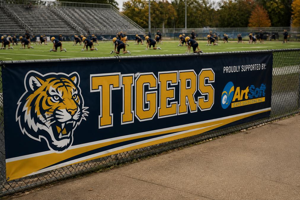
Keep the palette to two or three colors from your brand identity. High-contrast pairs, such as dark text on a light field or white text on a deep team color, hold up best. Low-contrast combinations like navy on black look sharp on screen and disappear from 15 metres away.
Typography follows the same logic. Bold fonts with wide letterforms read best at distance; reserve script and thin display faces for the team name only, if at all. Body text, sponsor names, and secondary information should be a clean sans-serif.
The most common mistake is design clutter: teams fit the roster, schedule, sponsors, and three logos onto one banner, and nothing is legible. Cut the content until only the essentials remain.
Print Files, DPI and Printing Methods Explained
Print files fail for two reasons: resolution is too low, or artwork is not sized to the final dimensions. Both are avoidable before you send anything to a printer.
DPI stands for dots per inch. Large format printing uses lower DPI than small print because viewing distance is greater: a banner viewed from 6 metres or more prints well at a fraction of the resolution a business card needs. The file must be built at final size, not scaled up afterward.
Vector graphics are safest for anything with a logo or text, scaling to any size without losing sharpness.
A practical checklist before you send a file:
- Artwork built at final size, not scaled
- Logos supplied as vector or high-resolution raster
- All fonts outlined or embedded
- Colors set in the correct profile for the printer
- Bleed and safe margins included
- Sponsor logos supplied by the sponsor, not pulled from a website
Mounting, Display and Maintenance for Long Banner Life
A well-made banner can fail in a week if mounted badly. Hardware matters as much as the print.
Maintenance is simple but easy to skip:
- Wipe with a soft cloth and mild soap, never a solvent
- Check grommets and ties after every storm
- Take banners down before extended high-wind forecasts
- Store rolled, not folded, to avoid permanent creases
- Rotate sponsor banners so none fades unevenly
Compliance, Sponsorship Placement and Eco-Friendly Options
Compliance and sponsor placement are the two areas where teams most often run into trouble after the banner is printed.
Frequently Asked Questions
What are the most common mistakes when designing team banners?
The biggest mistakes are overcrowding the layout, using low-contrast colors, and setting text too small for the viewing distance. A banner read from 10 metres needs letters at least 7.5 centimetres tall. Skipping a bleed margin also causes logos or text to get trimmed during finishing. Keep the message to one team name, one logo, and one or two sponsor marks, then let white space do the rest. Always request a PDF proof before printing.
How do I choose the right material for outdoor sports banners?
Match the material to wind and exposure. A 13oz vinyl banner works for short-term outdoor use and most indoor displays, while 18oz heavy-duty vinyl handles repeated seasons and higher wind loads. For fence lines and open fields where wind passes through, an 8oz mesh banner reduces strain on the fence and the banner itself. All three accept grommets, hemmed edges, and wind holes for secure mounting.
What are the standard sizes for sports team banners?
Common sizes follow the viewing distance and the space available. Fence banners often run 1 metre by 2.5 metres or larger, while field entrance banners sit around 2.4 by 1.2 metres. Smaller formats like 45 by 60 centimetre pennants work for locker rooms and fan displays. Custom sizes are available, and a 13oz vinyl banner can be printed up to 3 metres wide.
How can I ensure my team banner remains readable from a distance?
Use high contrast between text and background, bold sans-serif fonts, and a clear visual hierarchy with the team name largest. A general rule is 2.5 centimetres of letter height for every 3 metres of viewing distance. Avoid thin fonts, script typefaces, and busy backgrounds behind text. Test the design by shrinking it to thumbnail size; if the team name and logo are still clear, the banner will read well on site.